For those of you who do not speak French, but are interested in my article in Pratique des Arts, I’m sharing the English translation and some photos of the article.
Pratique des Arts Magazine
1) Present yourself!
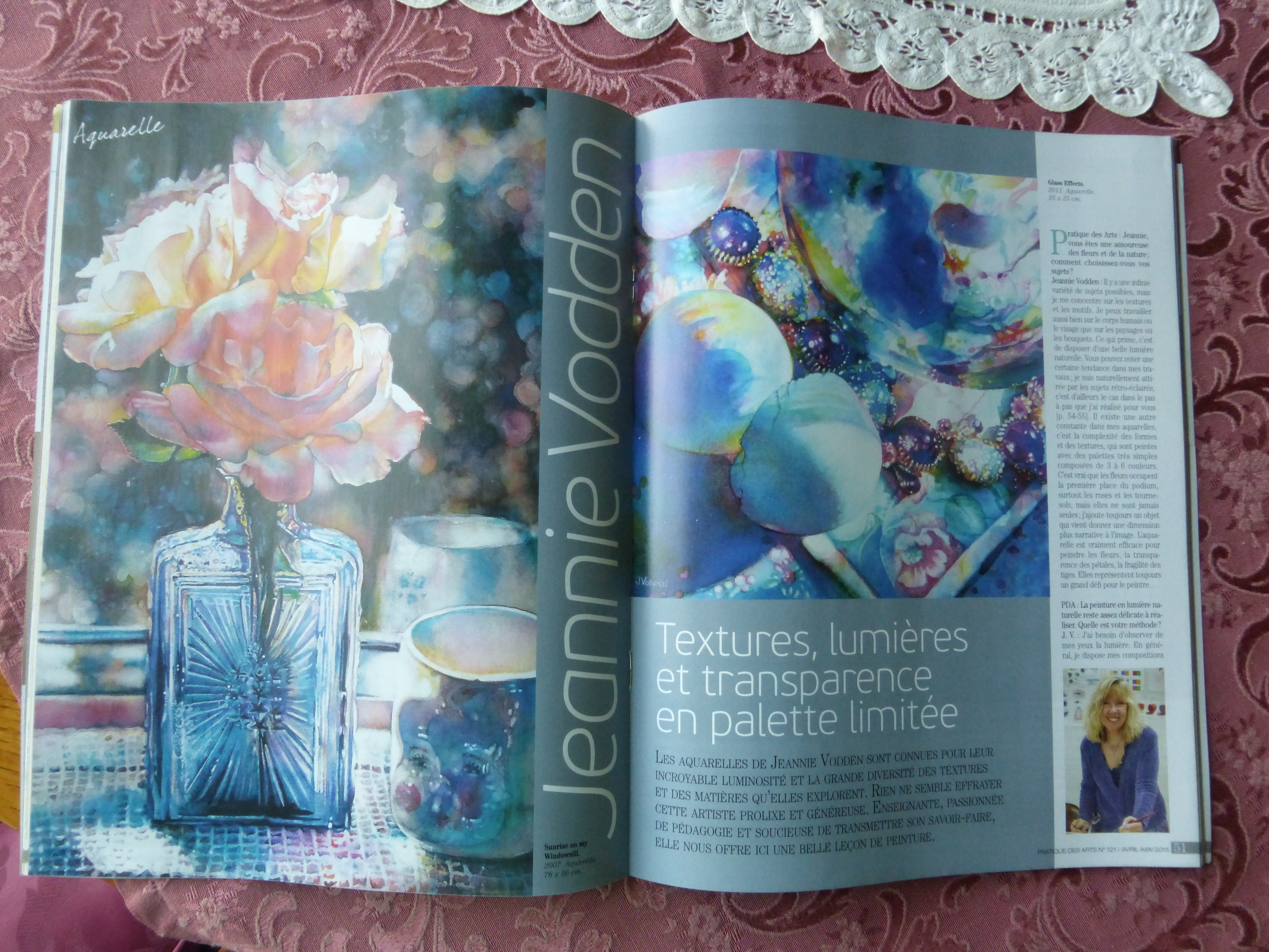
Jeannie Vodden has been painting or drawing most of her life. She started drawing portraits at about 10 years old. She was inspired early on by her Great Aunt who would sit her down with a magazine and say “pick out something and draw it”. She has always loved drawing.
As an adult she went back to school to study with Sacramento artist/teacher, Gary Pruner. Pruner was an excellent teacher with a wealth of knowledge who inspired Jeannie to learn and practice drawing, to understand design and color theory, and to learn about the history of art.
Jeannie began teaching watercolor in 1994, then demonstrating watercolor to local artist groups soon after.
Jeannie is now a popular instructor of watercolor. She has taught workshops throughout California and out of state. She enjoys demonstrating her watercolor techniques to art and community organizations and finds the challenge of judging art competitions rewarding and inspiring.
She has shown her work in galleries and businesses in Sacramento, Lodi and Stockton and throughout California, USA.
Jeannie has two grown sons and 5 grandchildren.
Awards and activities:
- Awards in the Stockton Art League’s competition at the Haggin Museum
- Acceptance into the prestigious 2000 and 2002 Crocker Kingsley competition at the Crocker    Art Museum in Sacramento, Ca.
- Awards at the “California Works†fine art competition at the California State Fair
- Honorable Mentions at the KVIE Annual Art Auction
- Many Best of Show and People’s Choice Awards
- The State of California has purchased two of her paintings for its archives.
For years she demonstrated watercolor in the “California Works†Fine Art Show at the California State Fair, sharing her work and talking to visitors of the well-regarded fine art venue.
In the fall she opens her home studio to the public for the Amador County Art Studio Tours.
Jeannie designs a theme fair window at the Amador County Fair each year for the Amador Stars, the local Cancer support organization.
For 2010 and 2011 and 2014 release she has designed unique and beautiful fine art wine labels for Young’s Vineyard in the Shenandoah Valley, California.
2) How do you choose a subject?
My interest in the variety of textures and patterns found in both natural and man-made objects is the starting point for many of my paintings. I like to have natural light. Many times back-lighting is my choice as in “My Sunny Window”.
I have a preference for the complex play of form and light which I balance with a very simple palette.
I love having a variety of objects with varying textures in my paintings. And, my favorite flowers (roses, hydrangeas, sunflowers, etc) or natural objects are always included. I love the fragile translucent petals or leaves and trying to capture that delicate feel is a wonderful challenge
 3) How do you organize the set up, do you have a special rhythm ?Â
I love natural lighting, so I tend to set up my still lifes in a window or sometimes outside.
I try to include some interesting background elements in the background, so it will be fun to paint and thus interesting to the viewer.
It’s important to me to have a variety of intriguing objects and a variety of textures.
I use photography to capture the moment. I will move objects around and photograph the changing light as it falls over the objects. Then I’ll look over the photos and pick the ones or one which strike me. It’s hard to say exactly why one “wins” over another. It’s partly composition and partly lighting which captures a certain translucence.
4) What are you telling us with this still life?
In “My Sunny Window” I am giving the viewer a sense of place (my country home), a sense of season (the summer), a sense of time of day, (the afternoon) with light shining through the window and trickling over a variety of surfaces. It has a sense of nostalgia and memory.
Sunflowers are cheery, and reflective of the idea of the warmth of the sun, so by including them in my painting I am recalling a warm and lovely moment. The addition of nest and the shell help to show people my love of nature.
5) Your best drawing memory and the worst?
I have many favorite drawing memories. One is mentioned above about my Great Aunt and her encouragement of my drawing practice.
Another is when I very first started drawing faces. I loved drawing famous people when I was a child, (like the Beatles). I would give my drawings to classmates who liked one or another of the Beatles.
The worst… Maybe when I was in school and had to keep a sketchbook diary. I tried to draw the American flag and my teacher’s comment was “missing stripes”. Haha. This was my entry into being intrigued with drawing fabric folds and pattern. Another object I had tried to draw was a shiny wood grain table. I drew it over and over and had a terrible time getting both the shiny surface and the grain of the wood. But, these experiences were both so instructive. We learn as much from our “failures” as our successes!
6) What is in your opinion a good composition? How do you construct a good drawing?
Composition is the arrangement of objects on the paper. We add interest by including overlapping shapes and a variety of size, shape and color. Composition is one of the basic elements in a drawing or painting that allows the eye to move easily around and through a painting.
7) Do you have some tricks? Could you give us some secrets ?
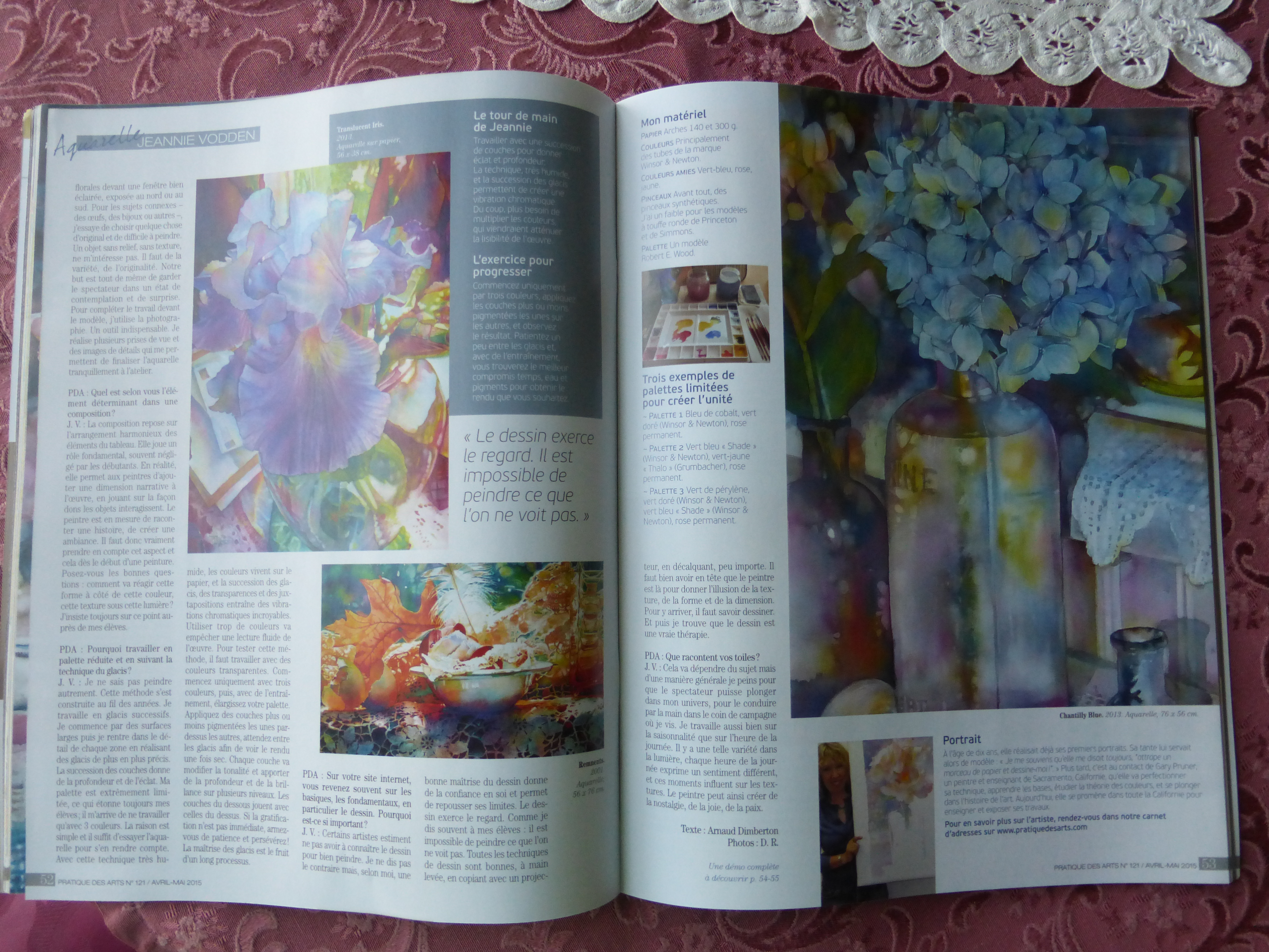
I paint in a series of layers in a process painting way, which means I paint large in large areas to small details working all over the painting.
I use a very limited palette, sometimes only three colors. But, by letting the color mingle on the paper and by the series of layers, the end feeling of a painting can be very translucent and have a depth of color that cannot be achieved by making exact mixes of color or by using a larger variety of tubes of paint. Also, using a limited palette creates a unity within the painting that I’m partial to.
Here are a couple of other limited color schemes that I like too:
Cobalt Blue, Winsor Green Gold and Permanent Rose
Winsor Green Blue Shade, Thalo Yellow Green (Grumbacher) and Permanent Rose
Perylene Green, Green Gold, Winsor Blue Green Shade and Permanent Rose
8) What type of material do you use? (I know you love Tempera tell us more about it…
My materials include Arches Cold Press paper either 140 lb (stretched on a board) or 300 lb (clipped on Gatorboard)
I use primarily Winsor and Newton watercolor paints. I use a very limited palette of staining transparent color. My favorite colors are Winsor Blue Green Shade, Permanent Rose and Winsor Yellow.
I use mostly synthetic blend round brushes. Princeton and Robert Simmons white sable brushes are my standards.
But, I also have a few small sable brushes that are favorites.
I use a Robert E Wood Palette
9) Why is drawing so important for a painter?
Drawing skill gives the artist confidence. Drawing and practice teaches the artists eye how to see … what you do not see you cannot paint. Drawing practice, even if you use a projector or tracing for a painting, helps the painter understand form and texture and shape and helps a painter give the illusion of dimension, of roundness. Without this skill and practice, objects can appear amateurish. Practicing drawing is so rewarding and I also find it is quite therapeutic.  Studying the drawings of the masters is so helpful too.
10 ) Colors, they are important to you how do you work with them.
I use a limited palette of staining transparent color. Starting with only three colors, and seldom using more than six, I glaze many transparent layers. Each layer modifies the last, changing the color and adding a multi-leveled glow… you can see the lower layers through the top most layers.   The visual effects of glazing are revealed in an unusual feeling of depth of color. The results are stunning and unique. This is not an instant gratification process, however, and takes much patience, practice and understanding of color glazing, which paints to use, and how each layer will affect the last.
Feb 3, 2015
Jeannie Vodden
“My Sunny Window” step by step
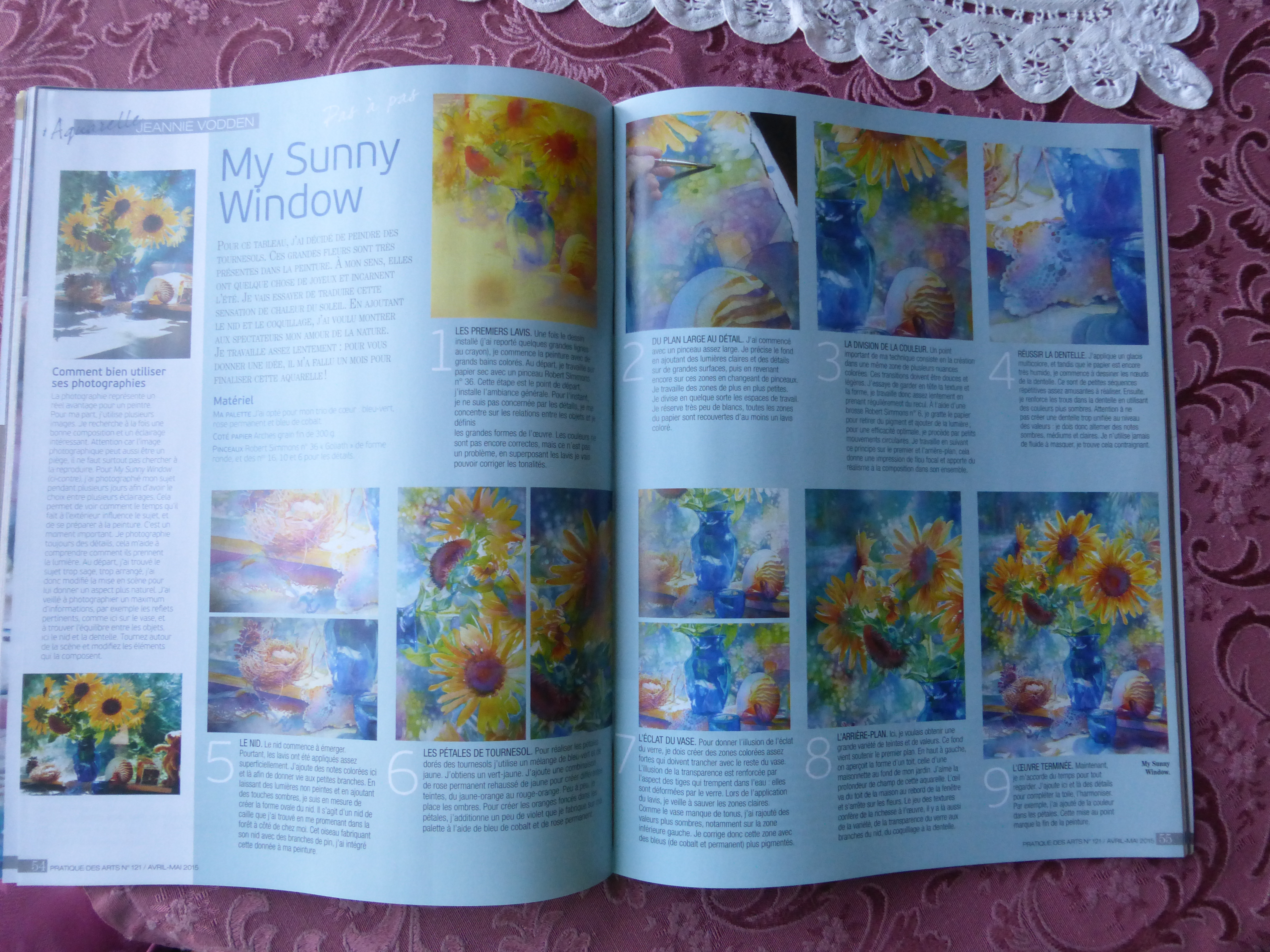
- Beginning a painting:
I spent some time photographing throughout the day as the light changed, moving objects around to vary the composition, and managed to get some really nice photos. It’s important for me to use photographs as I take many days to complete a painting.
I started my drawing by using a projector (Super Prism) to get the objects in the correct proportions, then went back to refine the details on my full sheet of Arches 300lb Cold Press watercolor paper.
In this painting I went into the background area noting with my pencil out-of-focus shapes and reflections in the window. In the lace, shell and nest, I made sure to get the patterns drawn in carefully.
- My Limited Palette:
           I like to use from 3 to 6 staining transparent pure colors in most of my paintings. I primarily use Winsor & Newton color. In “My Sunny Window” I chose my favorite triad: Winsor Blue Green Shade, Permanent Rose and Winsor Yellow, plus Cobalt Blue. These colors work beautifully together giving me a rainbow of color.
- Watercolor Washes:
           I started my painting by laying in large colorful very loose washes of mingled color on dry paper which then become the base of my painting. I used a Robert Simmons #36 “Goliath” round brush.
At this point I am not concerned with the details but rather the relationships of object to object and overall shapes. I refer to my photos for clues as to where I want my color to fall, though I am not at all disturbed if the color is not exact. As I add more layers to the painting I will modify hues, bringing them more into the local color, reflected light and shadows that will make the painting come to life.
- Working large to small:
           I work from large to small, applying my light layers over large spaces and then working in smaller and smaller areas, sort-of dividing the paper as I go. I leave very little white of the paper, so that almost every area of the painting has at least a light wash of color.
As I work in smaller areas I change to my Princeton brushes # 16, #10 or #6.
- Adding and subtracting color:
Part of my technique involves lifting color to create soft, light areas as well as texture and form. I lay down the watery wash of color, then wait a bit until the shine of the wet paper has gone mat, but the paper is still wet. Then taking my Robert Simmons White Sable round brush (either #6, #4 or #2) I pull out a bit of color, often using a circular stroke. I do this in the foreground objects to add subtle light areas. And, I also use this technique in my background to create an out-of-focus illusion.
- Lace:
           Starting with a multi-colored glaze, I used my lifting technique, while the paper is still damp to started to define the lace pattern.
Next, I started painting in the holes in the lace lightly, then came in with darker color, either using the cool color of my blues and rose, or the warm of my rose and yellow. Some of the holes have a very dark value and some are lighter and less defined. I tried to achieve a feeling of texture and volume along with the sense of light and shadow falling over the lace by just this simple method. I do not, as a rule, use masking fluid, salt or other devices.
- Nest:
The nest also emerges slowly as I start with just a simple undefined wash, pulling a little color out here and there to create my lightest twigs. By leaving areas of the nest light and painting in the darker shadows, I was able to achieve the round bowl shape and the sense of light moving over it.
This nest is a quail nest that I found while taking a walk in the forest near my home. It was made largely of Ponderosa Pine needles. I was keeping that in mind as I painted it.
- Sunflower Petals:
For the golden petals of the sunflowers I primarily used a mix of Winsor Blue Green Shade and Winsor Yellow to make yellow green, and a mix of Permanent Rose and Winsor Yellow to create various shades of yellow-orange through red-orange. Early in the painting you can see the petals have very little detail, but gradually I add more shadow and variety. To create the darker oranges in the petals I am also adding a bit of violet made from Winsor Blue GS or Cobalt Blue mixed with Permanent Rose.
- Blue Glass:
To give the illusion of the reflective shine of glass I needed to build up hard edged layers. To give the illusion of transparency I wanted to show some sense of the stems withing the vase. This I did with a series of washes, saving the light areas and painting into the darker, working from large shapes to small.
I had thought I was finished with the vase, but realized I needed to get darker on the lower area and that I had missed some subtle values on the right side. So, back in with another layer I went.
I used mostely Cobalt Blue and Winsor Blue with touches of Permanent Rose and Winsor Yellow as well.
- Background:
My goal in the background was to have variety of hue and value to support my objects and also to hint at the little house roof on the left and the window reflections on the right.
I like the multi-leveled idea of inside the room, the window surface and the out-of-doors.
- Multiple textures:
I love the combination of texture, from nest to lace, to shiny glass.
Here we have a sense of place (my coutry home), a sense of season (the summer), a sense of time of day, (the afternoon) with light shining through the window and trickling over a variety of surfaces.
- Activity:
Now I’ve added more detail in the centers of the sunflowers and defined their edges.
I like an abundance of activity in this painting which challenged me to achieve unity and still retain complication.
For success I needed:
- A Composition that allows the observer to move easily around and through the painting is key.
- I also find using a very limited palette in which each area of the painting has some amount of all three colors adds harmony.
- My brightest and warmest colors are in the sunflowers keeping the focus on the center of interest, while the other objects create a pathway toward the flowers.
- Understanding value, light through dark, aids in guiding the eye through the artwork.
- Finishing up:
I’m now taking time to just look and to add bits here and there to complete the painting. I’ve added some work in the upper part of the background around the sunflowers.  I felt that in the lower left part of the painting I needed to darken the shadow. And then I lifted some color out of the petals on the upper right sunflower.
Also I spent some time really studying the painting for any awkward edges and cleaning them up.
Gradually the painting comes into focus.
Often, 1/2 to 2/3 of the way through this long process I lose energy for the painting. My former teacher and mentor, artist Gary Pruner of Sacramento, talked me through this stage by encouraging me to remember my imagined vision at the beginning of the painting. This has helped me regain my energy and interest inumerable times and perhaps it will help you too.
My paintings can take from 2 weeks to 3 months to complete. This one took about a month.