Can you paint a lovely portrait or flower, but when it comes to the background you don’t know what to do?
This is an issue I hear from my students and followers on Facebook and YouTube many times over.
Ideas on the Figure Ground Relationship
Look for my tutorial on YouTube on how to paint my out-of-focus backgrounds! Jeannie Vodden – You Tube
Overlapping Plains
Creates a sense of depth.
Gives the illusion of moving into the picture plain
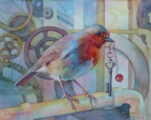
Figure as one of Many Forms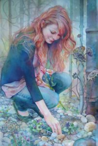
Makes the painting a lot of fun to paint.
You can use a garden, a large flower, or a distant landscape behind your figure.
Also think about stripes or a wall paper design and how that might look as background.
Think of how the background could tell a story about the person you are painting.
 Interacting Shapes and Colors
Repeating shapes and textures creates visual interest.
Find relationships between various subject matters included in the picture, searching for similarity of shape, texture and/or color.
Use of those similarities will also add unity to your composition.
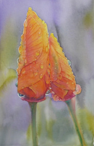 Complementary Shapes and Colors
Painting the background in a complementary color or style can enhance the foreground subject.
Here you will see detailed orange poppies with a soft green and violet wet into wet background.
This creates a triad of secondary colors (Orange, Green and Violet)
Visual Relationships Include:
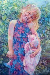
1) Light against dark/Dark against light
Changing the relationship of values around the main subject creates a sense of depth. In this example, just follow around the edge of the little girl in the painting and notice how the value relationship between foreground and background changes. In other words it’s not an all dark background with an all light foreground figure.
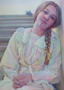
2) Complementary lines and shapes
Here we have a vertical figure complemented by horizontal stairs.

3) In focus/Out of focus
Here we have a large in focus subject in the foreground and the fun circles in the background suggesting out of focus.
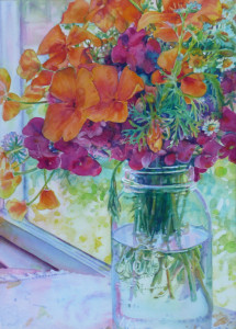
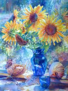 4) A Variety of Textures: rough/smooth/shiny/matte/etc
In this painting you can see examples of many different textures. This type of painting is a lot of fun and visually interesting, largely due to the textural effects.